

SYNOPSIS
Over a three-month engagement, I led a full rebuild of MOVA Technologies’ brand identity, positioning, and website. From market research and wireframes to a new brand kit and Webflow build, the project elevated MOVA’s digital presence into something credible, modern, and investor-ready. The result was a significant boost in site traffic and search rankings, alongside strong feedback from both MOVA’s leadership and prospective shareholders.
JUMP TO:
BACKGROUND
MOVA Technologies, based in Southwest Virginia, develops clean-air technology designed to capture and reuse airborne particles across industries. Their old website didn’t match the ambition of their work — outdated design, a lime-green palette, and cluttered pages left shareholders, partners, and visitors without a clear path. The leadership team needed a site that could tell their story clearly, present their team and technology with authority, and hold up under the scrutiny of investors.
PREVIOUS WEBSITE
The original MOVA site suffered from:
Generic imagery and unclear value proposition
A homepage without focus or a call to action
A lack of a separate “Our Technology” page to describe the core business model
A crowded, outdated team page without hierarchy which linked to PDF-uploaded bios
A color palette that felt mismatched with their credibility goals
OLD HOMEPAGE


OLD ABOUT PAGE
OLD OUR TEAM PAGE

OUR PROPOSAL
To rebuild MOVA’s credibility and make their story resonate with investors, I focused on clarity, structure, and story.
I began with market research across clean-tech competitors, studying how early-stage companies balanced technical depth with investor storytelling. From there, I proposed a new brand system that shifted MOVA’s palette from lime green to dark blue — signaling stability, trust, and long-term vision.
We grounded every page in a sense of place: the Blue Ridge Mountains, clean air, and agriculture — the same ecosystems MOVA helps protect. That became the visual and emotional thread through the entire site.
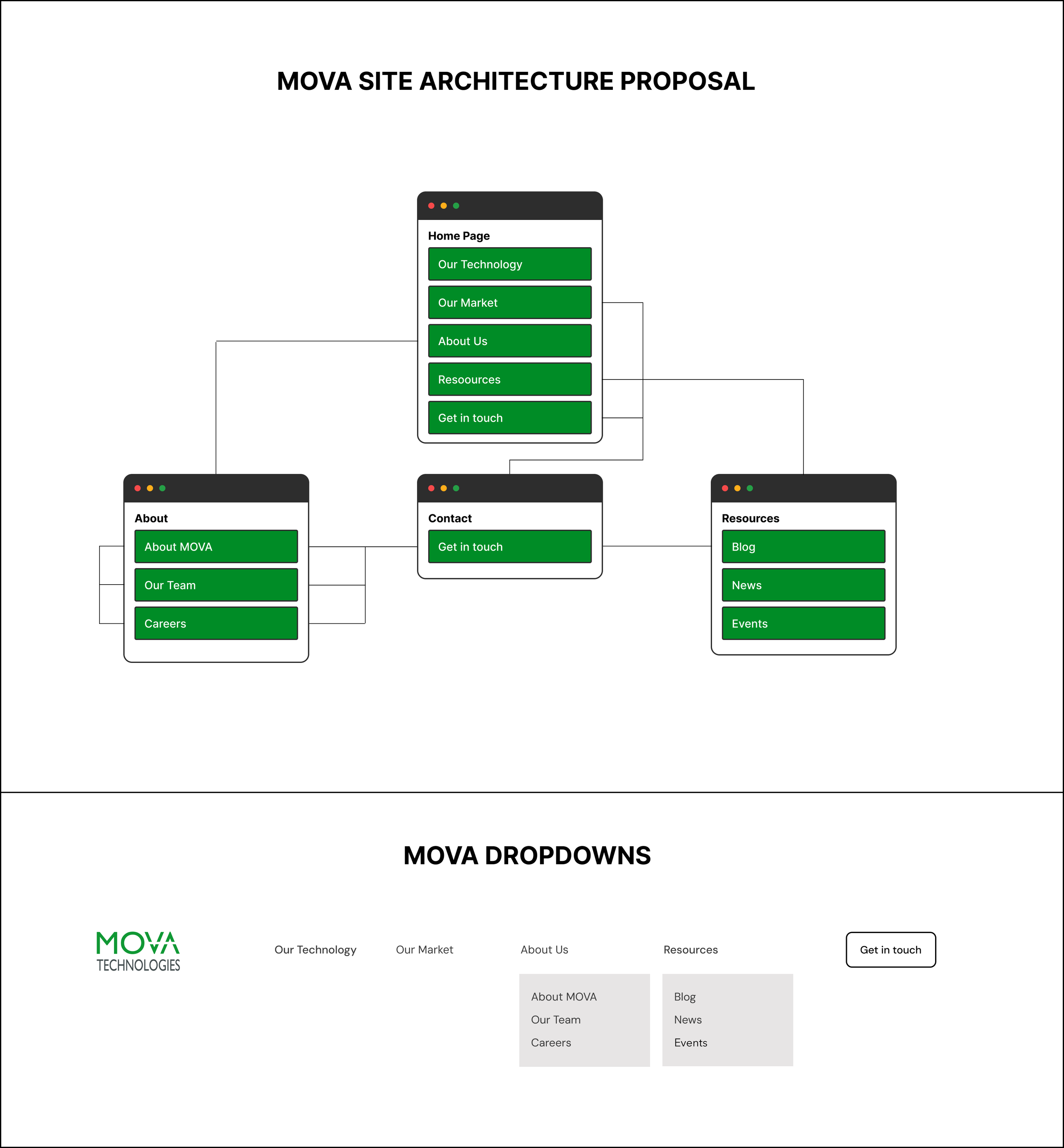
From wireframes to final Webflow build, we rebuilt the user journey from the ground up. Key improvements included:
Simplified site navigation and clear CTAs for investors and partners
Modular “Our Technology” cards to explain complex systems visually
A redesigned “Our Team” page using dropdown modals for easy scanning
New blog and news templates focused on imagery and accessibility
Scalable blog/news update structure for future growth
Through multiple feedback rounds, I worked closely with leadership to refine language, tone, and hierarchy until it reflected the precision and credibility MOVA needed.
SITE ARCHITECTURE
WIREFRAMES

FINAL WEB DESIGNS:
The new site highlights MOVA’s technology and leadership with clarity and credibility:
Homepage: Anchored in clean-air and mountain visuals, backed by partner proof and a focused call to action.
Our Technology: Dynamic, collapsible modular cards that break down complex systems into approachable explanations as you scroll.
Our Team: A structured layout with dropdown modals for board, advisors, and leadership, making credibility instantly scannable.
About MOVA: New sections on values and purpose, tied closely to community, sustainability, and the people behind the work.
HOMEPAGE
OUR TECHNOLOGY
ABOUT MOVA
OUR TEAM
RESULTS:
The redesign strengthened MOVA’s ability to engage investors, partners, and stakeholders:
Positive feedback from prospective shareholders, who cited the site as “professional and credible”
Praise from MOVA’s board and internal team, who felt the new identity finally matched the company’s mission
A noticeable lift in site traffic and improved search rankings following launch
A scalable foundation for future growth, content, and investor outreach